Waitrose Food Magazine
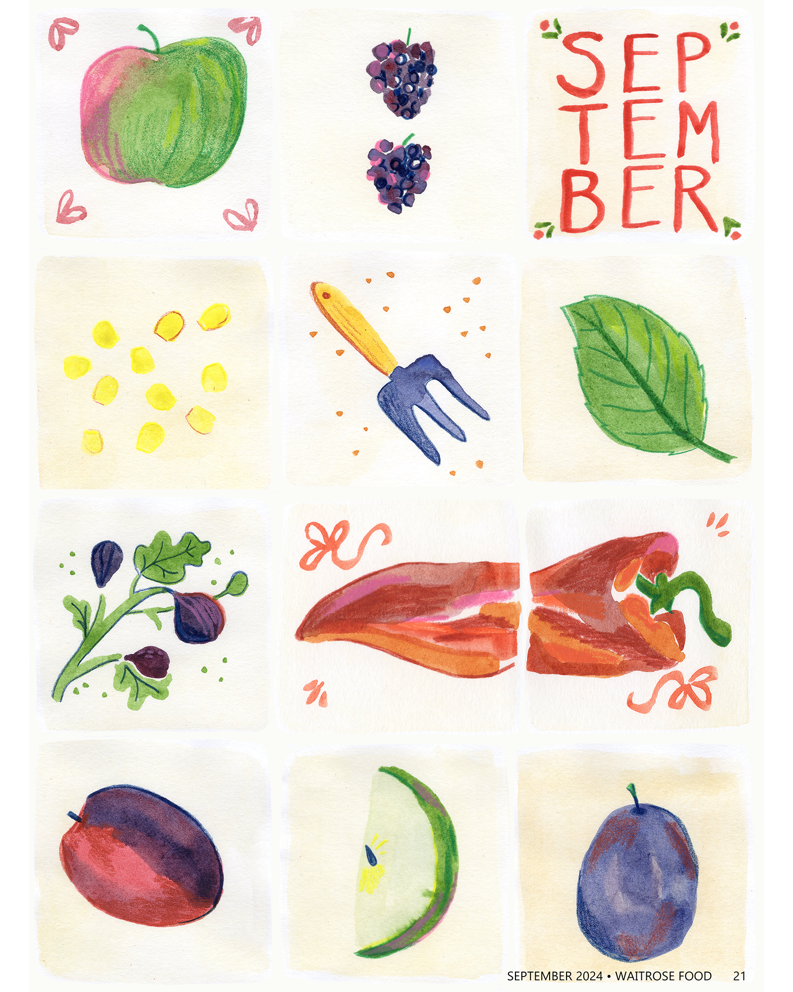
Speculative editorial piece for Waitrose Food Magazine. This double page spread celebrates fresh produce available in September and introduces the recipes segment of the publication.
I begin every project by taking some time to research the brand image, looking at existing works that fulfil a similar purpose, and examining my subject matter- in this case, vegetables.
I then begin drawing, often with my coloured pencils. I play with the subject matter experimenting with the different ways in which it could be portrayed.
Colour is essential to my practice so a colour palette is often my starting point when working on a composition.
Initial sketches
Once I’ve found some components that I like I will incorporate them into thumbnail sketches.
I can then develop my most successful thumbnails into rough sketches. When working on speculative projects I like to share roughs with friends and my Instagram community to be able to get feedback on which is working best for the brief.
Roughs
Final Outcome
The Process
In this case, the second rough composition was the most popular- and was definitely my favourite!
The concept was inspired by old tiles and crockery you get in your grandparent’s kitchen. They have a beautiful aged quality and are often hand-painted. I thought this vintage aesthetic would suit the brand well; added bursts of colour and a modern typeface would hopefully balance out the aged look.
From this point I then began working on the final outcome. I decided to use watercolour and coloured pencil, as the paints can give that aged quality.
I developed each tile and then edited and composed them on Photoshop to create the final outcome.


